Industrial IoT PaaS

ROLE
UI/UX Designer
ORG
ORing Cloud Team
TIMELINE
Sep 2019 - June 2020
PROJECT BACKGROUND
Transitioning from Engineering-Centric to User-Centric Design
The platform was primarily developed by engineers, resulting in a system that was functionally robust but difficult to use. As more features were added, the lack of a cohesive UI strategy led to fragmented workflows and increased complexity for users.
These issues began to affect how efficiently users could complete tasks and understand the system.
PROBLEM REFINEMENT
Through domain understanding and targeted user research, I identified several key usability and structural issues that impacted user workflows and overall experience.
Key Problems Identified
Fragmented Task Flow
Users needed to navigate across multiple pages to complete a single task, interrupting their workflow
Unclear Visual & Terms
Inconsistent labels and unclear iconography made it difficult for users to understand system actions and status
Inconsistent UI Patterns
Different interaction patterns across modules created a steep learning curve
SOLUTION
To address these issues, I focused on improving how users navigate, understand, and interact with the system across both structure and interface levels.
Restructuring Product Architecture and Core Workflows
Structure
Reorganized the platform around “Things” — the core entity users manage — instead of technical modules.
Frequently used actions were prioritized and repositioned to reduce navigation effort, while pricing and account features were integrated to improve visibility and completeness.

Flow
Redesigned the onboarding flow to reduce accidental registrations and user confusion.
Password setup was moved earlier, and field naming clarified to make required information easier to understand.
Before

After

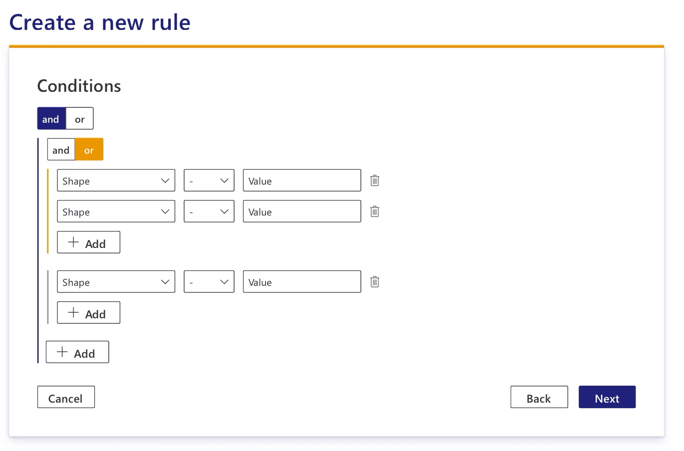
Complex Feature: Rule Engine
Simplified the rule engine by surfacing key information in the list view and reducing the need to navigate into detailed settings.
Interaction patterns were aligned with users’ mental models, making complex functionality easier to use.
Before


After

Validating and scaling the solution
After defining the structure and workflows, design decisions were validated through user testing and translated into a scalable design system.
Wireframes
Wireframes were used to validate interaction logic and identify usability issues early.
User testing revealed points of confusion in key flows, leading to clearer navigation and simplified interactions before moving into high-fidelity design.
Design System
A design system was established to ensure consistency and support scalability.
Based on the existing corporate identity, colors, typography, and components were standardized, improving readability for data-heavy interfaces and enabling more efficient design and development.

Final UI / Mockups
The final interface translated structural and interaction improvements into a clear and consistent experience.
Aligned layouts and interaction patterns made the platform easier to navigate and more predictable, especially for complex workflows.

OUTCOME
Enhancing product clarity and scalability to support business growth
The redesign improved the platform’s usability and visual consistency, resulting in a more polished and professional product. This strengthened the perceived reliability of the system and enabled the business development team to present and position the product more confidently to potential clients.
One of the key outcomes was establishing the company’s first reusable UI Kit. This became a foundational asset that improved consistency across the platform and accelerated front-end development speed by an estimated 30% for subsequent SaaS products built on the PaaS.
The project also improved collaboration between design and engineering by aligning design decisions more closely with implementation, enabling clearer communication and more efficient iteration in future development.